One sidebar for the whole app
The icon rail and morphing sub-menus are gone — replaced by a single sidebar with expandable groups, live channel status dots, and a collapsible customer panel.
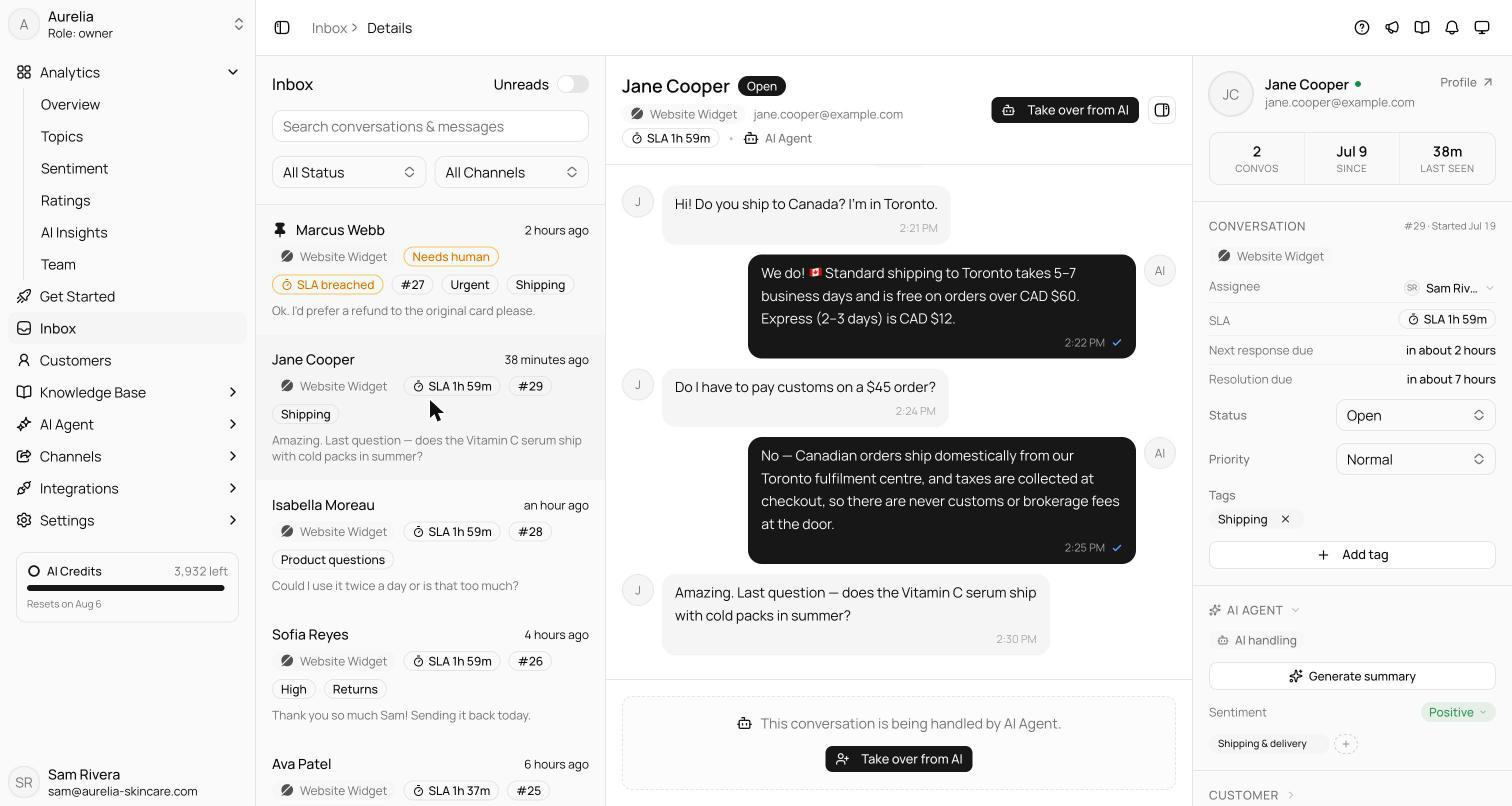
Navigation used to be two sidebars pretending to be one — an icon rail plus a sub-menu that morphed under you. It's now a single persistent sidebar with expandable groups: Analytics, Knowledge Base, AI Agent, Channels, Integrations, Settings. The active group opens itself, your expansion state survives reloads, and collapsed mode turns groups into tidy flyouts.
Details worth noticing: the Channels group shows each channel's brand icon with a live status dot, the knowledge storage meter lives inside the Knowledge Base group, and the inbox's customer panel is now collapsible — with its state remembered — so small screens stop feeling crowded.
How the groups behave
The sidebar is organized into expandable groups — Analytics, Knowledge Base, AI Agent, Channels, Integrations, Settings, and Help Center where it's enabled. The interaction model is deliberate: clicking a parent navigates to the section, while the chevron expands the group — you never have to open a menu to get somewhere. The active group expands itself, only one group stays open at a time so the list never sprawls, and both your expansion state and a manual collapse persist across reloads. The sidebar you left is the sidebar you come back to.
Collapsed to icon mode, groups become flyout menus — full navigation in a rail's width.
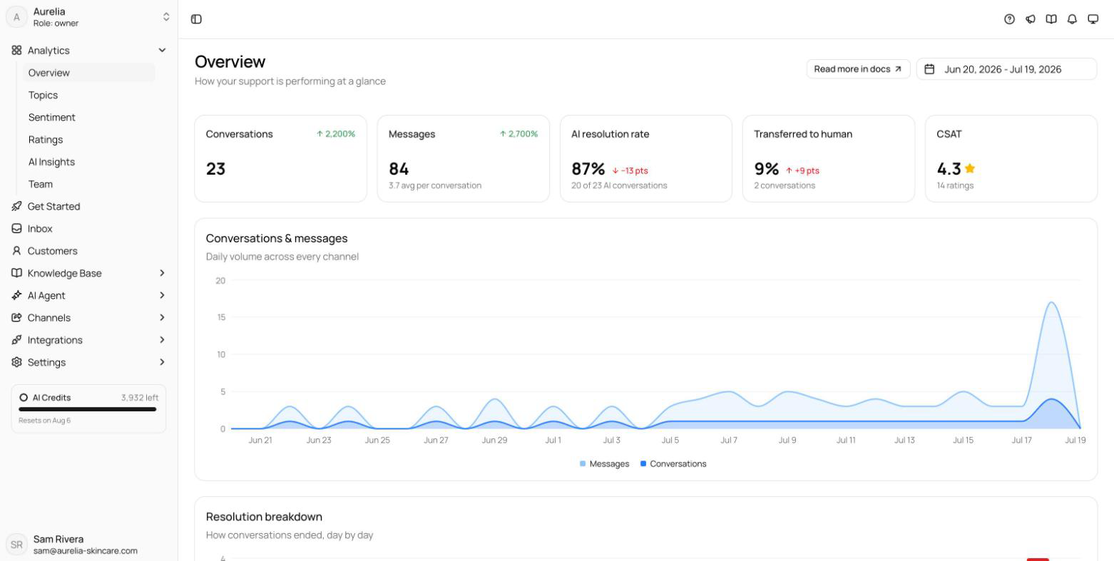
The details that make it work
- The Channelsgroup shows each channel's brand icon with a live status dot — connection health at a glance, without opening the page.
- The knowledge storage meter lives inside the expanded Knowledge Base group, next to the content it measures.
- The inbox conversation list moved out of the sidebar into the page content, where it belongs — navigation and data no longer share a column.
- The customer panel is collapsible via a header toggle, auto-hides below 1280px, and remembers your choice.
The net effect is that navigation stopped being a thing you think about. The old icon rail and its morphing sub-sidebar asked you to hold a mental map of two columns; the unified sidebar is one list that stays where you put it.
See what's new in your workspace
Everything on this page is live today. Asks trains on your website and resolves customer conversations on every channel — free to try, live in minutes.