Widget branding: remove the profile picture, themes that behave
The chat header's profile picture now has a proper Remove option, and the Light and Dark themes render exactly as designed — custom colors stay in Custom.
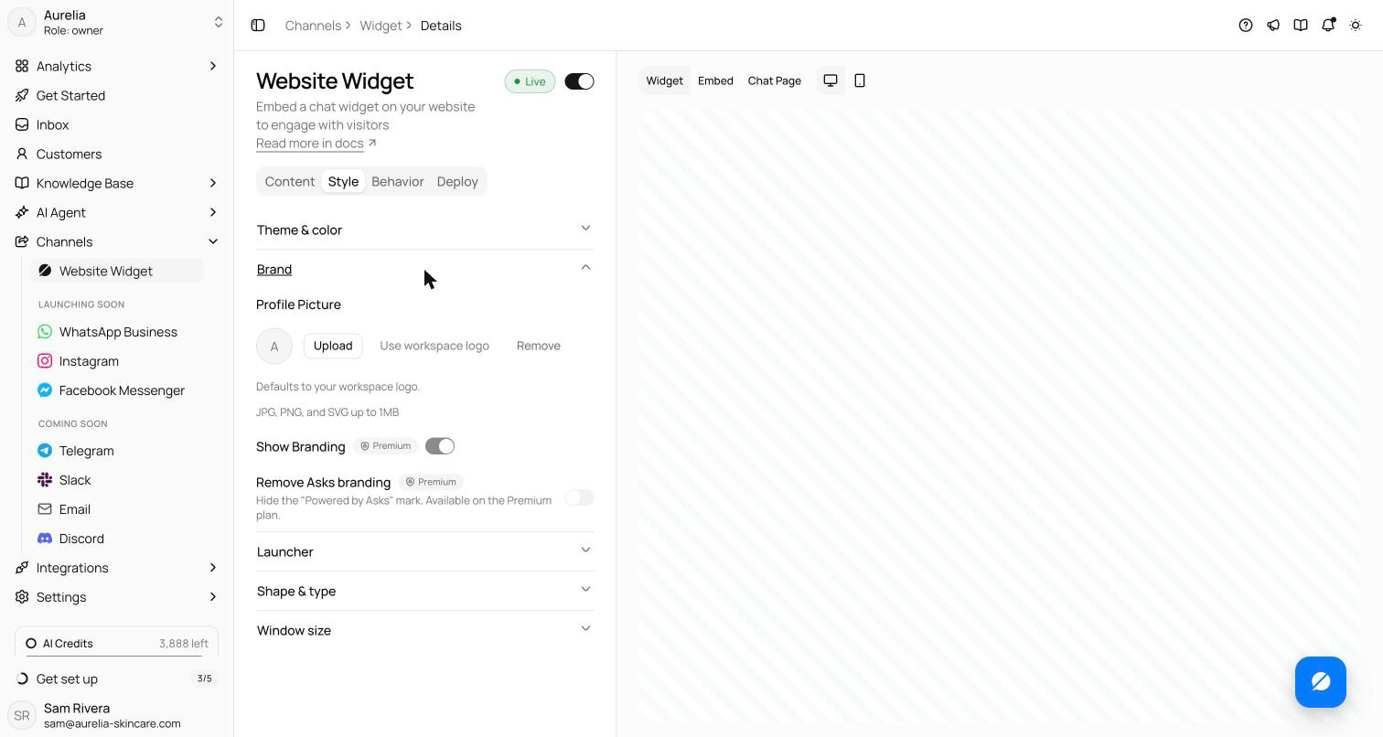
The widget's profile picture now has three honest states in Channels → Widget → Style: upload your own, inherit your workspace logo, or remove it — in which case the chat header shows the Asks mark instead of forcing an avatar on you.
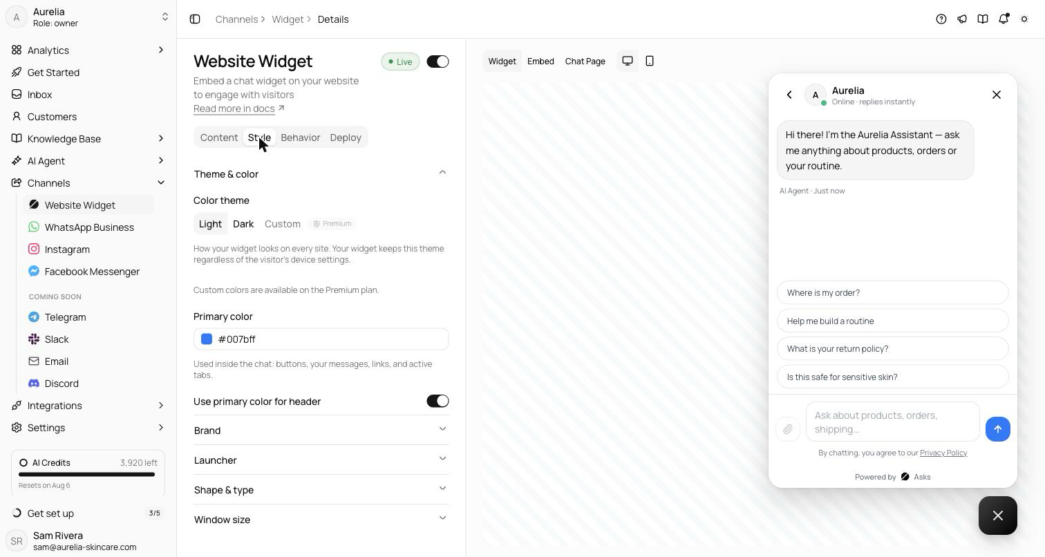
Themes got stricter, in a good way: per-color customizations now apply only when your theme is Custom. Light and Dark render their designed palettes exactly — no more dark composer leaking into a light widget — and colored surfaces pick their own contrasting ink automatically. The greeting field grew into a proper multi-line editor while we were in there.
Three states for the profile picture
Under Channels → Widget → Style → Brand, the profile picture — the avatar in the chat header — now has three explicit states. Upload your own (JPG, PNG, or SVG up to 1MB), inherit your workspace logo (the default), or select Remove. Removed means removed: as the helper text puts it, “Removed — the chat header shows the Asks mark instead.” No avatar is forced on a widget that doesn't want one.
Custom colors stay in Custom
The theme system got stricter. Per-token colors — the composer input's background and text, accent text, links — used to leak into the Light and Dark presets, so a workspace that had once experimented with Custom could end up with a dark composer sitting in a light widget. Those tokens now apply only when your theme is actually Custom; Light and Dark render their designed palettes exactly. Surfaces painted with your primary color also pick a contrasting ink automatically, so text stays readable whatever color you choose.
Smaller fixes that add up
- The widget preview's customer bubble now matches the live widget exactly — what you style is what ships.
- The greeting field became a multi-line textarea, so a two-line opening message no longer has to be written blind.
- The “primary color too light” warning now compares your color against the actual chat background rather than assuming white — dark-themed widgets stop getting false alarms.
See what's new in your workspace
Everything on this page is live today. Asks trains on your website and resolves customer conversations on every channel — free to try, live in minutes.