The launcher wears your brand now
The widget button always derives from your primary color — with the Asks mark or your own uploaded icon on top — and the pre-chat form is gone for good.
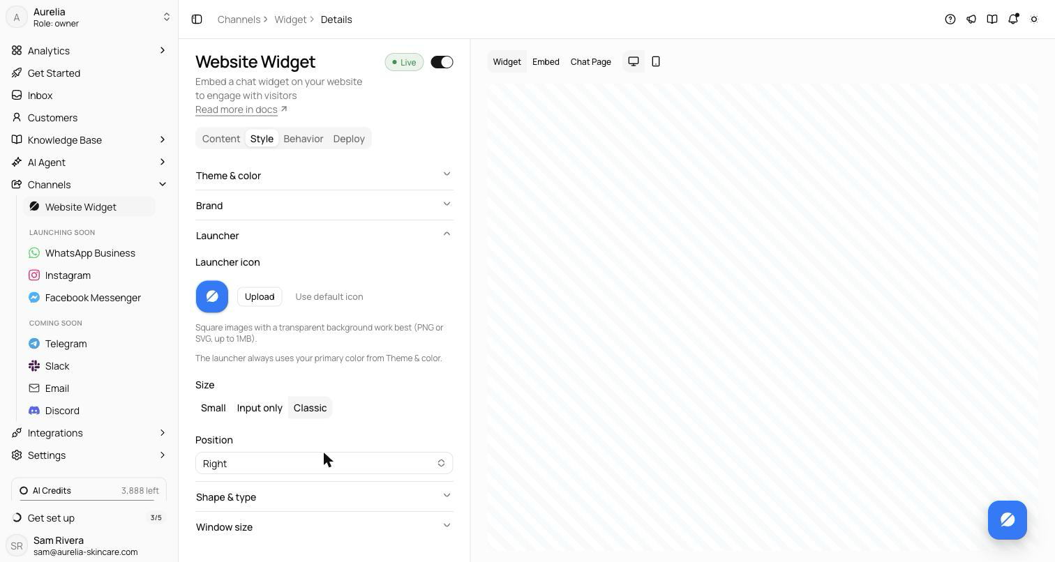
The little round button on your site is the most-seen pixel of your support experience, so it stopped being configurable into incoherence. The launcher now always derives from your primary color, with an automatically contrasting mark on top — or your own icon: upload a square PNG or SVG under Channels → Widget → Style and it renders over your brand color, falling back gracefully if the image ever breaks. The old separate launcher color and six-icon picker are gone, and so is the flash of default blue before your config loads.
Also gone: the pre-chat form. Nothing stands between a visitor and their first message anymore — the agent collects names and emails conversationally, when it's actually the right moment.
One color, everywhere
The launcher's background and focus ring now always derive from the primary color you set under Theme & color — the same accent that drives buttons, links, and your messages inside the chat. There is no separate launcher color to keep in sync, so the button on your site can never drift out of step with the conversation it opens.
By default the button carries the Asks brand mark, and the mark's ink is chosen for you: dark on light backgrounds, light on dark, based on the contrast of your primary color. The launcher also stopped flashing default blue while your configuration loads — it renders in your color from the first frame.
Or your own icon
To replace the mark, go to Channels → Widget → Style → Launcher and use the Launcher icon upload. Square images with a transparent background work best — PNG or SVG, up to 1MB. The icon renders over your primary-colored button, and if the image ever fails to load, the launcher quietly falls back to the Asks mark instead of showing a broken square. A Use default icon button resets you back whenever you want.
The same section sets the launcher size — Classic, Small, or Input only— and whether it sits on the right or left of the page. As the settings page itself puts it: the launcher always uses your primary color from Theme & color.
The pre-chat form is gone
The blocking form that asked for a name and email before a visitor could type has been removed entirely — nothing stands between a visitor and their first message. Contact details are now collected conversationally by the agent through Data Collection, which asks at a natural moment in the conversation rather than at the door. That is the lead-capture path going forward.
See what's new in your workspace
Everything on this page is live today. Asks trains on your website and resolves customer conversations on every channel — free to try, live in minutes.